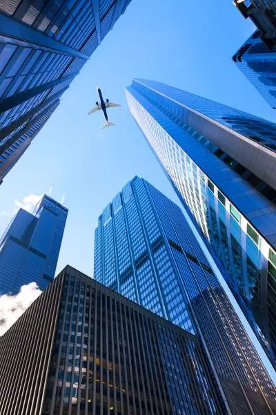
Chicago is one of the world’s great architectural destinations. Walk along any downtown street and you’ll see example after example of superb design, from neo-gothic, to art deco, to modernist, postmodern, contextual, contemporary, and everything in between.
No matter where you go, you’ll see something to impress and inspire. If you want to trace the history and evolution of the city’s skyscraper design, these 11 examples are some must-sees.
1920s
Tribune Tower
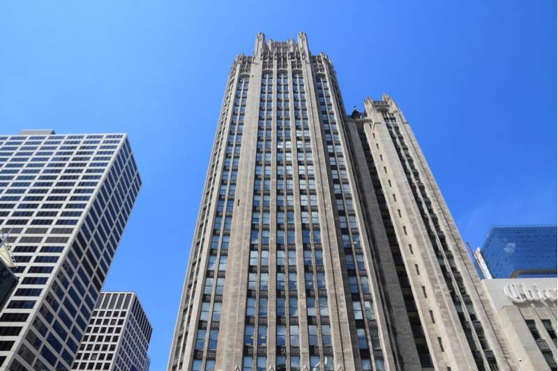
You could say the neo-gothic Tribune Tower was award-winning from day one. Its design was the result of a competition the Tribune held to create the “most beautiful and distinctive office building in the world.” Whether or not it meets that lofty standard, it definitely remains a striking specimen nearly a century after its completion. Keep an eye out for Aesop’s Screen above the main entrance, a carving which features icons representing architects Howells & Hood: a dog (Howells) and Robin Hood (Hood).
Carbide & Carbon Building
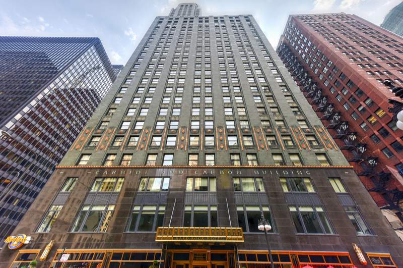
The original owners of this art deco triumph wanted their building to make a statement. Given the admiring gazes the building continues to draw today, they were successful. While grand in many ways, its most striking feature must be its colors and the materials used in its construction. The tower’s dark green terra cotta with gold leaf accents stands out amongst the area’s predominant shades of gray and black, and the gold spire (covered in real 24 karat gold, just one five-thousands of an inch thick) stands as a brilliant tribute to the roaring ‘20s. Some say the entire building was designed to resemble a champagne bottle, but you can judge the resemblance for yourself.
Wrigley Building
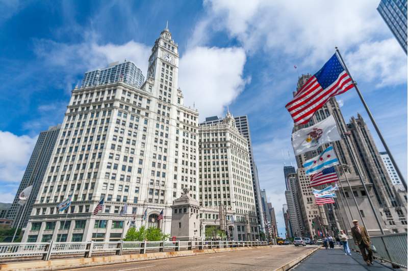
Watching over the Chicago River, this Magnificent Mile gateway is one of the city’s most distinctive buildings, and the first major office building built north of the Chicago River. Its design was influenced by owner William Wrigley Jr.’s memories of the 1893 World’s Columbian Exposition and its “White City,” a series of gleaming white buildings illuminated at night by brilliant electric lights. To achieve a similar effect, the building was clad in 250,000 terra cotta tiles in six shades of white, which make it appear brighter as it rises. The building is floodlit at night, and handwashed to keep its shine as brilliant as it was back in 1921. It’s also notable as the first office building in Chicago to offer air conditioning, a feature quickly adopted by buildings across the city.
Jewelers’ Building
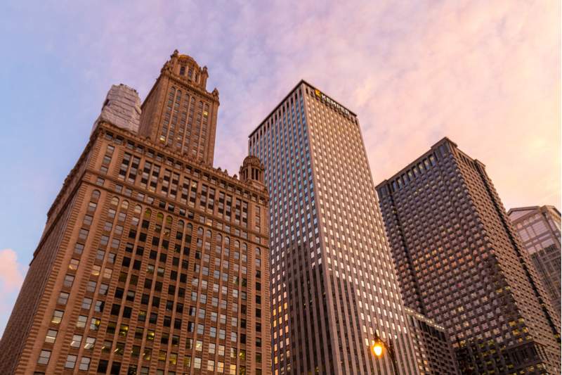
The Jewelers’ Building stands out for its tower and cupola, which almost looks like another small building stacked on top. When it was completed in 1927, it featured a couple of unique innovations: the world’s tallest parking garage (23 floors), and a car lift which could carry armored cars directly to the building’s tenant jewelers. But these didn’t stick around long—the lift often broke down, and as car designs changed to become shorter and wider, they no longer fit the lift or the parks. But the building’s ornate beauty remained a selling point, and the building itself a source of intrigue. For many years people have speculated that the cupola housed a prohibition speakeasy run by Al Capone. In reality, it was a post-prohibition restaurant called the Stratosphere Club.
1930s
Chicago Board of Trade Building
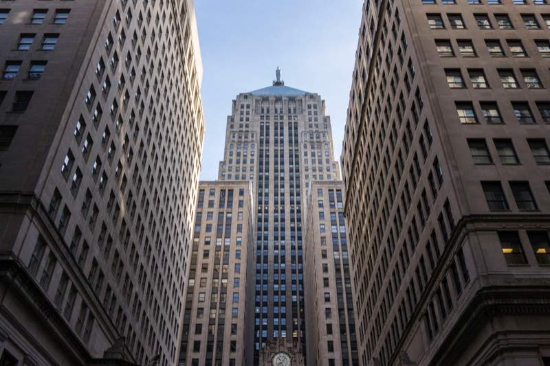
The art deco Chicago Board of Trade Building was Chicago’s tallest building between 1930 and 1965, and it still presents a commanding image at the foot of South LaSalle Street. It looks impressive any time of day, but if you want to see its full majesty, approach it from South LaSalle at night. The upward-facing floodlights atop its many setbacks give the building a golden glow, topped by the shining beacon that is a 6,500-pound statue of Roman goddess of agriculture, Ceres.
1960s
Marina City
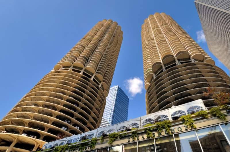
It was a revolutionary design for a revolutionary concept. Marina City was developed by architect Bertrand Goldberg as a “city within a city,” a residential mixed-use complex intended to attract middle-class people back to inner-city residences. To that end, it included retail space, a movie theater, swimming pool, a bowling alley, 19 floors of car parking and a small marina for pleasure boats. But its most notable quality must be that corncob design. Goldberg believed that as no right angles existed in nature, they shouldn’t exist in living spaces either. Every one of its 900 apartments includes a curved balcony, which lends the building its distinctive shape.
875 N Michigan Avenue (formerly John Hancock Center)
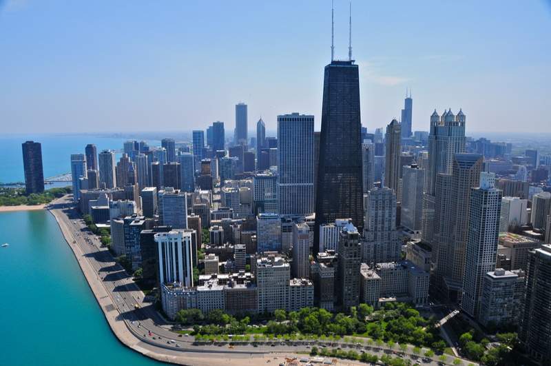
You won’t have much trouble seeing this building: as Chicago’s third-tallest, it’s clearly visible amidst the city’s skyline. It also features a distinctive exterior. The trusses and bracing running up its length aren’t just decorative, they form the engineering trick that allowed it to become Chicago’s tallest building. It’s also notable for its tapered shape, which helped the building meet the needs of its various tenants. The retail and parking spaces toward the bottom require large floors but few windows; whereas the smaller floors on the residential levels allow each tenant exterior windows.
1970s
Willis Tower (formerly Sears Tower)
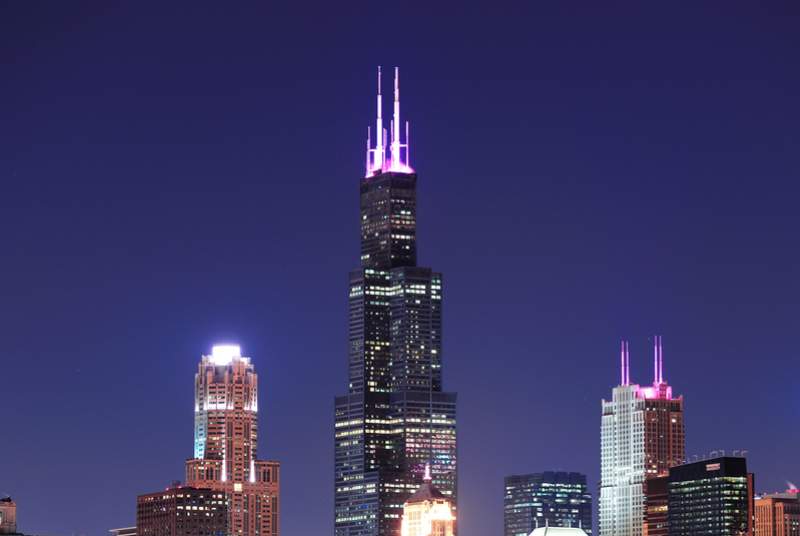
John Hancock’s reign as Chicago’s tallest building was short lived, when the Sears Tower (now Willis Tower) came along to take that title, as well as title of world’s tallest building. Perhaps it would have grown even taller, if not for the fact its ground-to-roof height already reached the maximum height then imposed by the Federal Aviation Authority of 1450 feet. This incredible height was achieved by the first use of Chicago-based architect Fazlur Rahman Khan’s bundled tube structural system. It was a similar concept to that used in the John Hancock Center (also designed by Khan), and it has since been used in most other supertall buildings, including the current tallest building, the Burj Khalifa. Although the Willis Tower no longer holds the title of world’s tallest building, or even its original name, it remains a source of fascination for visitors and pride for Chicagoans.
330 N Wabash/AMA Plaza (formerly IBM Building)
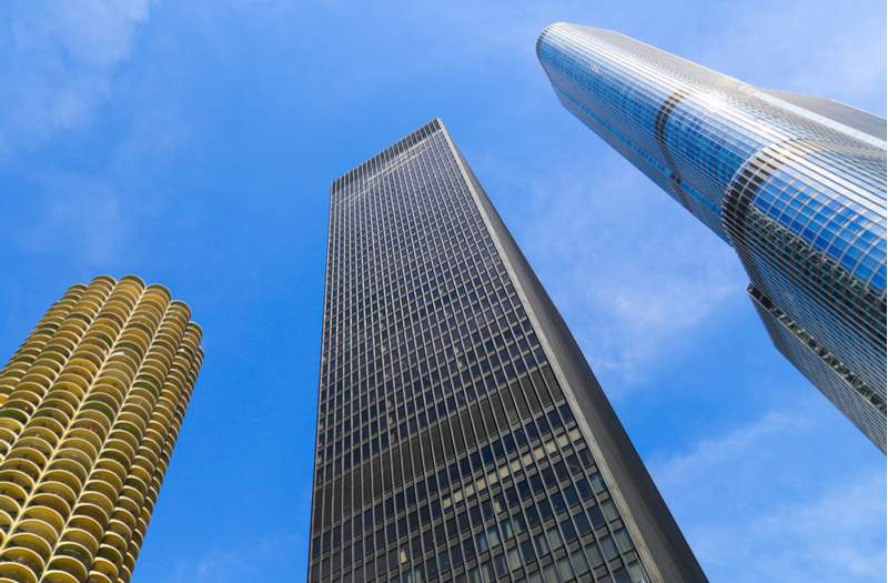
Architect Ludwig Mies van der Rohe had an enormous impact on Chicago architecture in the mid-20th century, both in buildings he designed himself, and the influence he had on a generation of other architects. His philosophy was one of “less is more,” his buildings examples of what he called “skin and bones” architecture—simple, efficient structures which are stripped bare of all unnecessary design flourishes. This building, originally designed for IBM, captures his style perfectly. Its black anodized aluminum frame and grey-tinted glass carry a sense of power and stability, and looking up at its monolithic form, you can’t help but feel a sense of awe.
1980s
333 West Wacker
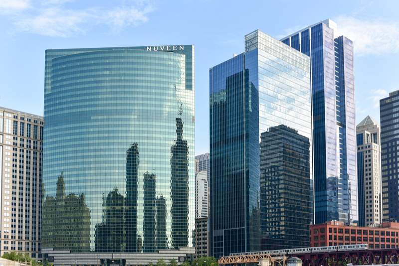
333 West Wacker is remarkable for how it manages to both stand out and blend in. Stands out, because its curved glass façade is markedly different to the rectangular boxes that adjoin it. Blends in, because that façade is colored and shaped to complement the Chicago River that passes on the north and west. With its highly reflective surface and blue-green color, it almost feels like part of the river itself. It’s perhaps Chicago’s greatest example of contextual architecture; buildings which take design cues from the surrounding landscape and existing architecture. This respect for what came before it is perhaps one of the reasons it’s such a local favorite.
2000s
Aqua
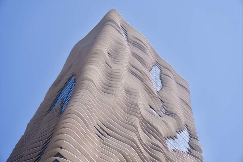
333 West Wacker’s gentle curve represented a break from Chicago’s mid-century architectural styles, and Aqua took it in another direction again… at least on the surface. At its core, the building is actually a fairly ordinary rectangular shape. But its balconies give the building a feeling all of its own; an undulating surface reminiscent of organic forms, limestone formations or the waves of nearby Lake Michigan—depending on who you talk to. But the balconies aren’t just placed that way for decoration. They help the building cope with the wind, provide shade for other apartments and contribute to a more social community by letting residents talk with the tenants above and below. Designed by Jeanne Gang, Aqua is the tallest building by a female lead architect.
Learn More Stories of Chicago’s Downtown Architecture
Want to learn more about Chicago’s downtown architecture? The best way to experience it is onboard a Chicago River architectural boat tour offered by Shoreline Sightseeing, Wendella or the Chicago Architecture Center. Or, visit the Chicago Architecture Center to see exhibits about architecture from all around the city.
Share your Moments
#EnjoyIllinois

